Once you have data in Microsoft Dynamics Sales, you need to make sense of it. Copilot’s visualization feature turns your views into charts in seconds—no manual exports or pivot tables required.
Starting with a View
First, you need a view with the data you want to visualize. In our example, we’re looking at opportunities filtered to show only records with estimated revenue data. No point charting empty fields.
You can visualize any data in the system:
- Opportunities
- Leads
- Accounts
- Contacts
- Whatever you’re tracking
The key is filtering your view first. Get the right data on screen, then visualize it.

One-Click Visualization
Once your view is set, click the Copilot Visualize button. That’s it. Copilot takes the data in your current view and generates a chart automatically.
In our opportunities example, the chart shows:
- X-axis: Estimated close date by month
- Y-axis: Estimated revenue
- Columns: In-progress opportunities
If your data includes multiple statuses, you’d see different colored columns for each status. More categories mean more colors. The visualization adapts to what’s in your data.
Customizing the Chart
The initial chart is a starting point. You can adjust:
- Chart type: Bar, line, pie, whatever makes sense
- X-axis: Change what’s displayed horizontally
- Y-axis: Change what’s measured vertically
- Group by date: Switch from month to quarter for a broader view
Let’s say you want to see opportunities by quarter instead of month. Change the grouping and the chart updates instantly.
Or maybe you want to visualize by account instead of time period. That works too, though it gets busier if you have a lot of accounts. The system doesn’t limit you—customize however you need.
Copy and Use
Here’s the practical part: once you have a chart you like, copy it. Paste it into PowerPoint for a sales meeting. Drop it into a Word doc for a quarterly review. Send it in an email to your manager.
No screenshots. No reformatting. Just copy and paste.
That means when someone asks “What does our pipeline look like this quarter?” in a meeting, you can answer in real time. Filter your view, generate the chart, paste it into the presentation deck. Done in under a minute.
Why This Matters
Most teams export data to Excel, build pivot tables, format charts, and update them manually every week. That’s hours of work for something that should be automatic.
Copilot visualization eliminates that loop. Your data lives in Microsoft Dynamics Sales. Your charts should too. And when the data updates, you can regenerate the chart instantly. No stale reports. No version control issues.
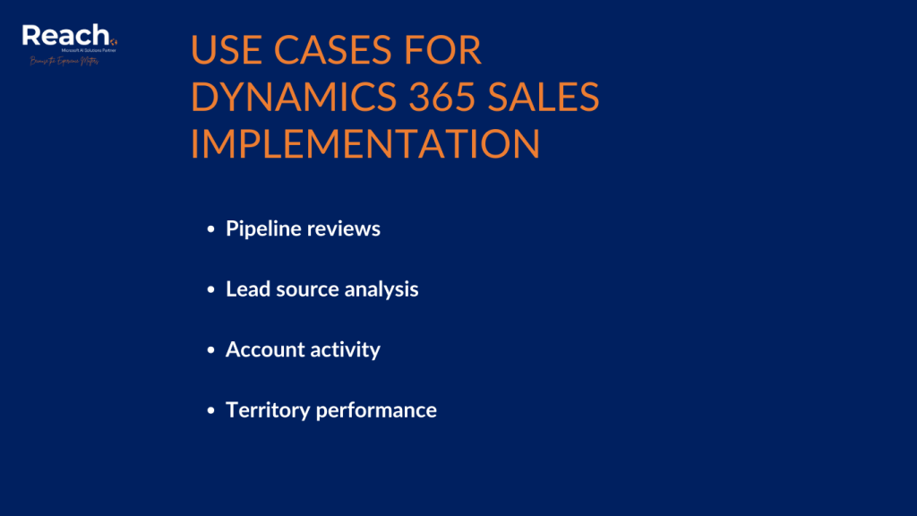
Use Cases
Pipeline reviews: Filter opportunities by stage, visualize by close date, see where your revenue is concentrated.
Lead source analysis: Group leads by source, visualize conversion rates, identify which channels are working.
Account activity: Filter accounts by owner or region, visualize by relationship type or revenue, spot patterns in your customer base.
Territory performance: Compare opportunities across sales reps or regions, see who’s ahead and where deals are stalling.
The visualization adapts to whatever question you’re asking. The data is already there. Copilot just makes it visible.
The Limitations of Microsoft Dynamics Sales
This isn’t Business Intelligence. You’re not building complex dashboards with drill-downs and custom calculations. It’s quick visualization for the data you’re already looking at.
If you need more sophisticated reporting, Dynamics 365 has Power BI integration for that. But for day-to-day questions—”What’s my pipeline?” “Where are my deals?” “Which accounts are active?”—Copilot visualization is faster.
Getting Your Team to Use It
The barrier to visualizing data used to be technical skill. Not everyone knows how to build a good chart. Not everyone wants to learn.
Copilot removes that barrier. If you can filter a view, you can create a chart. That means more people will actually look at the data instead of guessing or going by feel.
When visualization is this easy, it becomes part of your workflow instead of a special project. You check your pipeline visually every morning. You generate charts for meetings on the fly. You answer questions with actual data instead of “I think” or “probably.”
The Practical Reality
Data visualization should be effortless. You’re already in the system. The data is already filtered. One click should give you a chart you can use.
That’s what Copilot does here. It’s not revolutionary—it’s removing friction from something that should have always been this simple.
Filter your view. Click visualize. Copy the chart. Use it where you need it. That’s the workflow. Anything more complicated and people stop doing it.
Ready to get your sales team up and running in Dynamics 365? Our Rapid Sales Implementation gets you live in weeks, not months.